Como crear una identidad de marca para tu negocio

Identidad de marca | Cómo construir una marca | Parte 2

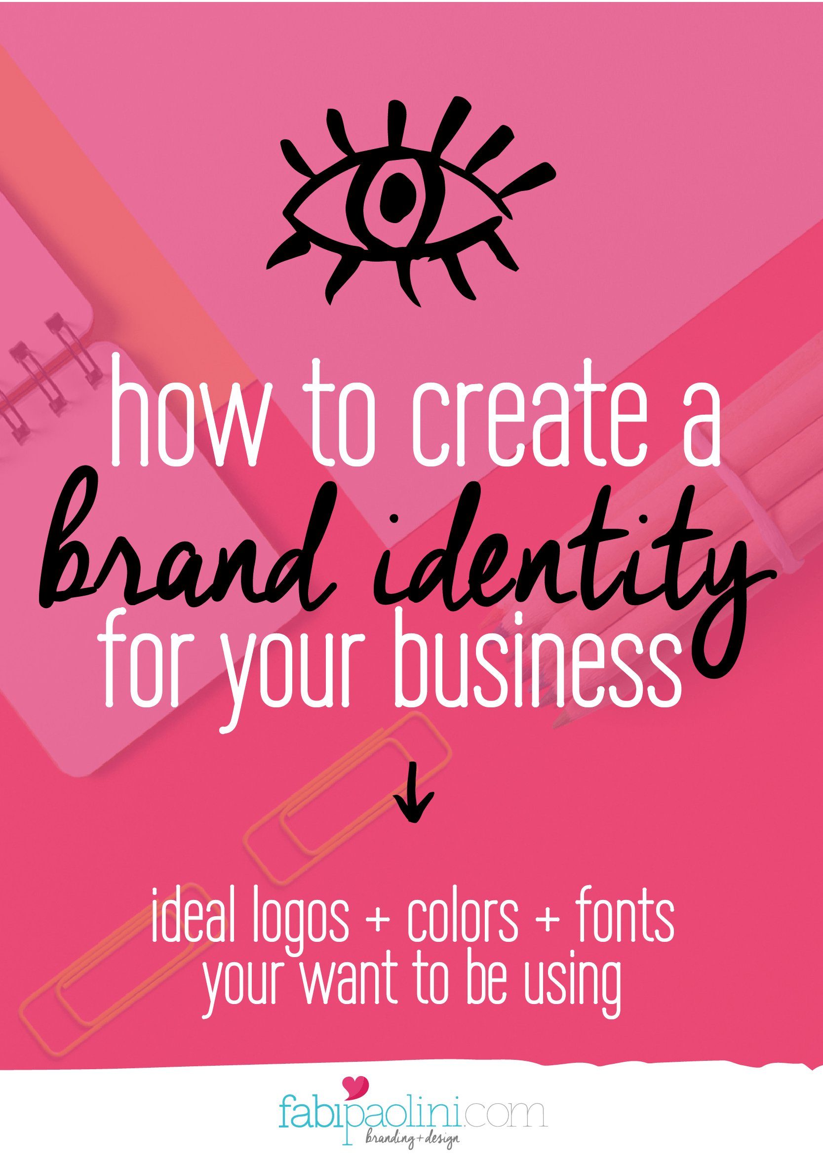
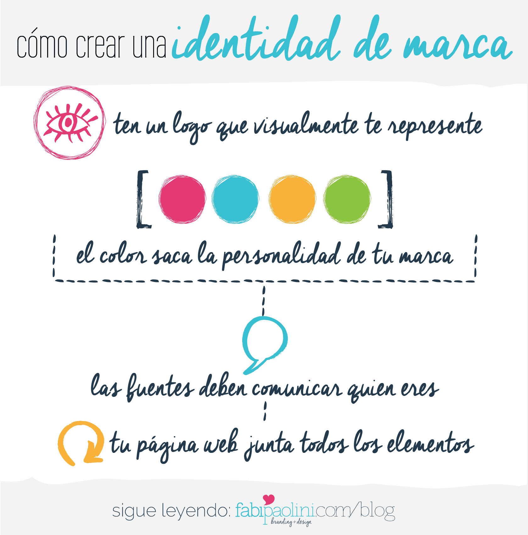
Branding es lo que hará que tu negocio o blog pase de ser un simple hobby a ser un estilo de vida con el cual puedes ganarte la vida. Se trata de lo que la gente dice + piensa + siente sobre tu marca. Aquí te doy los pasos para lograr un buen branding, asi podrás construir un negocio capaz de transformar tu vida.

Como crear una identidad de marca para tu negocio

En la Parte 1 de Cómo Convertir tu Negocio en una Marca, hable sobre la importancia del branding. Verás, branding es lo que te da claridad para saber a donde quieres ir. Es lo que te diferenciará de todos los demás. Cuando aplicas el branding correctamente, podrás formar las percepciones alrededor de tu negocio/blog. No sólo eso, el branding te hará ver profesional, por lo que crearás credibilidad y confianza. El Branding está basado en tres diferentes pilares: La Fundación de tu Marca ( sobre la cual hablamos en La Parte 1), la identidad de tu marca y la experiencia de marca.
Creé esta guía, Brand Your Business, especialmente para ti. Te guiará a crear tu propia marca. Puedes descargarla aquí:


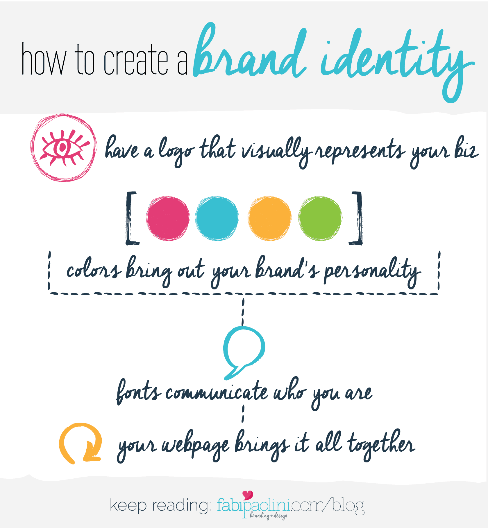
El Segundo Pilar: La Identidad de Marca

Entonces, en este punto ya deberías haber definido la fundación de tu marca. Ya sabes la misión detrás de tu negocio y por que es tan importante hablar sobre el valor que estas creando por otros a través de lo que escribes o haces. También ya deberías haber definido lo que hace a tu negocio 100% único de todos los demás. Ahora es momento para determinar como se verá tu negocio desde afuera.

Tu logo es la primera impresión que das sobre tu marca. Es la representación visual de lo que tu negocio es. Los logos son, sin duda, unas de las que más disfruto hacer. Me encanta investigar, garabatear y traer ideas que representen y expresen todo lo que es el negocio.

Ahora, cuando estas definiendo tu propio logo, recuerda que no tiene que necesariamente mostrar literalmente lo que haces, o sobre lo que escribes. Después de todo, una de las compañías más grandes de computadoras en el mundo tiene una manzana en su logo. No una computadora. Sin embargo, lo QUE SI ES importante es que tu logo sea capaz de mostrar tu personalidad y esencia. Tu logo es algo que será visto en todas partes: tus tarjetas de presentación, perfiles de redes sociales, página web, firma de correo, newsletter, empaque… la lista podría seguir y seguir. Así que querrás asegurarte de que sea suficientemente fuerte y capaz de reflejar quien eres.

Saber quien eres como marca empieza entendiendo la personalidad detrás de ella. Carl Jun, un psicólogo suizo, determinó que los seres humanos tendemos a poner las cosas entre categorías, las cuales agrupamos dependiendo de como somos. Agrupamos las cosas con el fin de entenderlas mejor. Lo mismo pasa en términos de marcas, y en este caso, estas diferentes categorías son llamadas Los Arquetipos de Marca. Cada una de las 12 variedades tiene diferentes grupos de características, rasgos, estrategias y estilos de comunicación que definen marcas + negocios. Por supuesto, como en todo, ninguna marca tiene 100% una personalidad. Mas bien, somos una mezcla de diferentes cosas que nos hacen destacar como un todo, pero normalmente hay un arquetipo que tiende a ser más dominante que el resto.

Los arquetipos de marca tienen un gran poder detrás. Ellos realmente son capaces de representar quien eres y las estrategias que puedes usar en el futuro. Yo uso los arquetipos de marca para diseñar logos hermosos. Me guían para entender cómo un negocio debería verse desde afuera también. Nicole Bevilacqua Coach Branding + design Fabi Paolini
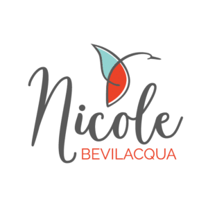
Por ejemplo, mi cliente Nicole es una coach para mujeres que es una mezcla entre Héroe + Sabio. Eso quiere decir que ella empodera a las mujeres a ser fuertes y competentes. Sus estrategias involucran alentar a las mujeres a desafiar las reglas y ser líderes auténticas. Su logo tiene sentido con su marca. Tiene que ver con abrir las alas, como lo hace un pájaro.

MiaMommy Branding + logo design + web design Fabi Paolini

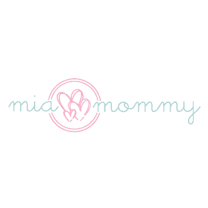
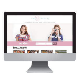
Otro de mis clientes bloggers, es Mia Mommy. Ella escribe siendo la mamá de 3 niñas. Su arquetipo es ser la chica regular y su estrategia es conectar con otros a través de sus historias. Su logo tiene 3 corazones, cada uno representa a sus hijas. La letra que utilicé parece escrita por niños pero es chic. Este logo representa su personalidad y estilo. Puedes ver el caso de estudio completo aquí

Los Arquetipos de Marca son increíbles y tu puedes encontrar estrategias y metas a seguir dependiendo de cual de todos se aplique mejor para tu negocio o marca!
Puedes encontrar tu arquetipo de marca aquí:

Tu Logo

Color

Los colores son una magnífica manera de contar la historia de quien eres como negocio y de expresar tu personalidad. Si, hay estudios que demuestran que ciertos colores provocan diferentes emociones (puedes ver esos en la guía, por cierto). Has leído probablemente que el rojo se relaciona con la pasión, el verde pertenece a la tierra, azul es confiable, naranja es cálido y amarillo es amigable.

Sin embargo, hay algo que va más allá de las emociones que cada color trae. Se trata más de la personalidad detrás de tu marca. Entonces, por ejemplo, con marcas grandes como Citibank y twitter, cada uno de sus logos tiene un tono similar de azules. Si el azul tiene que ver con ser confiable, es algo que tiene sentido para un banco, pero ¿cómo es twitter confiable? La verdad, es que se trata más de la personalidad de tu blog. Cómo tu marca es afectada por lo que quieres decir. Entonces, en este caso, el uso de tonos similares de azul, debe tener que ver con verse joven y estar dirigido más hacia los millennials.

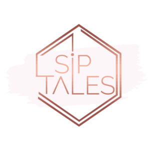
Me encanta cómo el color es capaz de provocar diferentes emociones sobre lo que eres y lo que quieres transmitir. Por ejemplo, desarrolle el branding y el logo de Sip Tales. Ellos tienen un concepto súper cool de negocio. Es un lugar social donde amigas(os) se reúnen para tomar vino y pintar. Sin embargo, es un negocio que esta orientado hacia clientes de clase alta. Hay otros negocios similares, pero la GRAN diferencia de Sip Tales es que es más lujoso. A través del color, tu captas inmediatamente de que es una marca elegante y de gama alta, ¿verdad? Si el ejemplo fuese verde brillante, te diría algo totalmente diferente sobre su personalidad.

Sip Tales Art + Wine Branding + Design Fabi Paolini En el caso de Yarel Ramos, sus colores dicen una historia diferente. Yarel es una Presentadora de TV Mexicana muy conocida. Su marca personal tiene que ver con ser divertida y al mismo tiempo sacar a relucir su cultura Mexicana. Los colores que use para su marca representan precisamente eso. No sólo son divertidos, también son colores que están muy conectados con la cultura mexicana. Yarel Ramos Logo Branding Design Fabi Paolini


Fuentes

En el caso de las fuentes, querrás asegurarte que las que uses realmente tienen que ver con tu marca. Una de las cosas más importantes es que seas consistente con las fuentes que usas. Por ejemplo, si la fuente del texto de tu blog es Raleway (como en este caso), todo lo que escribas ahí debe ser Raleway también. Todo este tipo de detalles son esenciales para construir una marca que sea cohesiva y que verdaderamente resalte. Las fuentes, como el color, causan emociones también.

La fuentes Serif son más serias y generalmente son usadas para negocios que quieren construir credibilidad y quieren ser vistos confiables. Las Serif tienen pequeñas líneas al final de cada letra. El grupo MCQ por ejemplo, es una empresa de construcción de techos que trabaja directamente con su gobierno estatal. Entonces, como podrás imaginar, era importante que su logo se viera audaz.
MCQ Group Branding + logo design + web design Fabi Paolini

Las fuentes San Serif normalmente dan un look más moderno y elegante. Estas fuentes son las que NO tinen pequeñas lineas al final de cada letra. Un buen ejemplo de esto es este logo que creé para una boutique en Caracas, Venezula. ¿Ves como las lineas son rectas y finas? Tienden a dar un look súper cool.
Friends Branding + logo design + web design Fabi Paolini

Las fuentes que parecen escritas a mano, por otra parte, son buenas para las marcas personales. Normalmente expresan carácter y personalidad. Me encanta usar fuentes escritas para coaches porque tiende a expresar quienes son. Sandra es una asesora personal y coach de imagen, y su logo expresa quien es también. Sandra Aristizábal Image coach and personal branding | Branding + Design Fabi Paolini

Finalmente, las fuentes Scripts son usadas para expresar elegancia y clase. Utilicé una fuente Script para el logo de Rococoa porque ellos querían dar esa sensación parisina chic e interesante. .Rococoa Branding + logo design + web design Fabi Paolini 
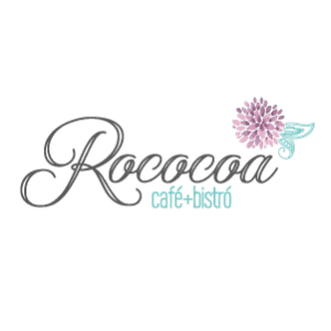
¿Tiene sentido? Las fuentes son también buenas contando historias y expresando quien eres.

Habiendo establecidao la fundación de tu marca y entendido tu personalidad, las fuentes van de la mano con las estrategias que ya estableciste para tu marca.
Puedes ver más información sobre fuentes en la guía que creé para ti. Asegúrate de descargarla aquí:


Tu Página Web / Blog

Cada uno de estos elementos de los que he hablado hasta ahora, definirá la manera en como tu marca se ve, y ellos deben estar en tu página web. Obviamente tu logo debe estar en la parte de arriba de tu página, los colores deben ser consistentes y las fuentes deberían ser las mismas. Tener muchas cosas al mismo tiempo sólo confundirá a tu audiencia y harás un trabajo pobre construyendo tu marca. Es muy importante que tu negocio tenga coherencia en su estilo y comunicación con tu misión, y que el logo, los colores y las fuentes que uses sean capaces de realmente representar lo que eres.

Entonces, por ejemplo, en el caso de Mia Mommy (la que te mostre arriba), su página web es consistente con su marca. Los colores, las fuentes y el uso del logo esta en tono con la marca.
MiaMommy Mia Mommy theBlog blog Branding + Logo + Web design | Fabi Paolini
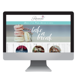
El mismo concepto debería aplicar en tu página web. Otro caso donde trabaje con los colores, fuentes, logo comunicación y estilo fue Rococoa Café + Bistro. ¿Entiendes cómo funciona?
rococoaweb-04


Como crear una identidad de marca para tu negocio

¿La parte más importante para construir la identidad de tu marca? Consistencia y coherencia. Por una parte, debes asegurarte de que tu marca sea consistente en todos los lugares donde la gente la encuentre. Por otra lado, es importante que tu identidad sea coherente y tenga sentido para la fundación de tu marca. En la parte 3 hablaré de la consistencia cuando hable sobre la experiencia de marca. En la parte 1 sobre la coherencia cuando hable de la fundación de la marca.
En la guía gratis de 15 páginas, podrás ver el panorama completo de los 3 pilares del branding. No olvides descargarla aquí:

Entonces, ¿cuál es el arquetipo de marca que más representa a tu negocio? El mio es una mezcla de Creador + Mago
¡Me encantaría escuchar con el que más te identificas!

KEEP ON READING
  • Como convertir a tu negocio en una marca. Branding. Los 3 pilares del branding
  • Construyendo una experiencia de marca
  • Cómo incrementé mis ingresos un 1000% en 6 meses
  • Branding mas alla del logo. Diseño. Mision, propuesta unica de valor, valores, marcas, negocios. Fabi Paolini Branding Design
How to Brand Your Business. Branding + business tips and advice. Brand identity. How to choose a logo design, colors and fonts. Free branding guide inside

Brand Identity | How to Brand Your Business | Part 2

Branding is what will take your business or blog from being just a simple hobby to being a lifestyle through which you can make a living. It’s all about what people say + think + feel about your brand. Here I give you the steps to branding so that you can create a business capable of transforming your life.

This guide on how to brand your business will really help with tips ideas and advice for creating a brand identity and choosing logo, fonts and colors for your business. Read it to download the free 15 page guide inside!

In Part 1 of How to Brand Your Business, I talked about the importance of branding. You see, branding is what will give you clarity on where you want to go. It’s what will differentiate you from everybody else. When done correctly, you can help form the perceptions around your business/blog. Not only that, but branding will make you look professional which will build your credibility and trust. Branding is based on three different pillars: Your brand’s foundations (which we talked about in Part 1), your brand identity and the brand experience.
I made this guide, Brand Your Business, specially for you. It will guide you in building your own brand. You can download it here:


The Second Pillar: The Brand Identity

So, by this point you have already defined the foundations of your brand. You already know the mission behind your business and why it’s so important to talk about the value you’re creating for others through what you’re writing about. You have also defined what makes your business 100% unique and different from everyone else’s. Now it’s time to determine how your business look on the outside.

Your Logo

Your logo is the first impression you give about your brand. It’s the visual representation of what your business is all about. Logos are, without a doubt, one of the funnest things to make for me. I love researching, doodling and coming up with ideas that really represent what a business is all about.

Now, when defining your own logo, remember that it doesn’t LITERALLY have to show what you write about. After all, one of the biggest computer companies in the world has an Apple in their logo. Not a computer. However, what IS important is that your logo is capable of showing your personality and essence. Your logo is something that will be seen everywhere: your business cards, social media icons, webpage, email signature, newsletter, packaging….
the list could go on and on. So, you really want to make sure it is strong enough and capable of reflecting who you are.

Who you are as a brand starts with understanding the personality behind it. Carl Jung, a Swiss Psychologist determined that human beings tend to put things into categories which we group depending on what we’re like. We group things in order to understand better. The same thing happens in terms of brands, and in this case, these different categories are called Brand Archetypes. Each of the 12 varieties has a different set of characteristics, traits, strategies and communication styles that define brands + businesses. Of course, like with everything, no brand is 100% one personality. Rather, we’re a mix of different things that make us stand out as a whole, but with one archetype that tends to be more dominant than the rest.

Brand Archetypes have a huge power behind them. They really are capable of representing who you are and the strategies you can use in the future. I use Brand Archetypes a means of designing beautiful logos. You see, they guide me in understanding how a business should look on the outside too.Nicole Bevilacqua Coach Branding + design Fabi PaoliniFor example, my client Nicole is a woman’s coach that’s a mixture of a hero + sage. That means she empowers women to be strong and competent. Her strategies involve encouraging women to challenge rules and lead authentically. Her logo then makes sense with her brand. It’s about opening your wings, just like a bird.

MiaMommy Branding + logo design + web design Fabi Paolini

Another client of mine, blogger Mia Mommy writes about life as a mom of 3 girls. Her archetype is being a regular gal and her strategies are to connect with others through her stories. Her logo contains 3 hearts, each of which represent her  daughters. The font used looks like chic children’s writing. This represents her blog’s personality style. You can check out her complete Case Study here.

Brand Archetypes are incredible and you can actually find strategies and goals to follow depending on which one applies to you the most!
You can find out your Brand Archetype right here:


Color

Color is a wonderful way of telling a story about who you are as a business and what your personality is all about. Yes, there are studies that show that certain colors bring about different emotions (you can see those in the guide, by the way). You have probably read that red is attached with passion, green with being down to earth, blue is trustworthy, orange is warm and yellow is friendly.

However, there’s something that goes beyond the emotions that each color brings. It’s more about the personality behind your brand. So, for example, with big brands such as Citibank and Twitter, each of their logos is a similar shade of blue. If blue has to do with being trustworthy, that’s something that might make sense for a bank, but how is Twitter trustworthy? The truth is, that’s it’s more about the personality of your blog. How your brand is affected by what you want to say. So, in this case, the use of a similar shade of blue might have to do with looking young and targeting millennials even more.

I love how color is capable of bringing out different emotions for who you are and what you want to convey. For example, I developed the branding and logo for Sip Tales. They have a really cool business concept. It’s a social place where friends gather to drink wine and paint. However, it’s geared toward a high-end customer. There are other similar businesses around, but the big difference is that Sip Tales is more luxurious. Through color, you get an immediate sense that this is a chic, high-end brand immediately, right? If the logo for example were a bright green,  it would tell you something completely different about their personality. Sip Tales Art + Wine Branding + Design Fabi PaoliniIn the case of a logo like Yarel Ramos,’ her colors tell a different story. Yarel is a very well-known Mexican-American TV Host. Her personal brand is all about being relatable and fun, while at the same time bringing out her Mexican culture. The colors used for her brand represent precisely that. Not only are they fun, but they also are colors that are very connected with the Mexican culture.Yarel Ramos Logo Branding Design Fabi Paolini


Fonts

In the case of fonts, you want to make sure that the ones you use really make sense with what your brand is all about. One of the most important things is that you start being very consistent with the fonts that you use. So, if your body text is Raleway (like this one), every material that you put out there should have Raleway as well. All of these things will be essential in building a brand that is cohesive and truly stands out. Fonts, like color, bring about different feelings as well.

Serif fonts are more serious and are used for businesses that want to build credibility and want to be seen as trustworthy. Serif fonts have little lines at the end of each letter. MCQ Group for example, is a roof construction company that works directly with their local State government. So, as you can imagine, it was important for their logo to give a bold statement.
MCQ Group Branding + logo design + web design Fabi Paolini

A Sans Serif Font is used to give a more chic and modern look. Sans Serif fonts are the ones that DON’T have the little lines at the end of each letter. A great example of this the logo I created for a clothing boutique in Caracas, Venezuela. You see how the lines are straight and thin? They look to give a very cool look. Friends Branding + logo design + web design Fabi Paolini

Handwritten fonts on the other hand are great for personal brands. They’re used to show character and personality. I love using handwritten fonts for coaches because it brings out who they are to the table. Sandra is an image and personal branding coach, and her logo brings out who she is as well.Sandra Aristizábal Image coach and personal branding | Branding + Design Fabi Paolini

Finally, script fonts are used to show elegance and class. I used a script font for Rococoa’s logo because they were trying to give this very nice Parisian feel to their brand while looking chic and interesting.Rococoa Branding + logo design + web design Fabi Paolini Did that make sense? You see, fonts are also great at telling stories and bringing YOU out. Having established the foundation of your brand and understood your personality; fonts will go hand in hand with the strategies you have already set up in place for your brand.
You can see more info about fonts in the guide I created for you. Make sure to download it here:


Your Website/Blog

Every single one of these elements that I talked about so far, will define what your brand looks like, and they should come together in your website. So, obviously your logo has to be at the top of your site, the colors should be consistent throughout, and the fonts should be the same. Having too many things going on will only confuse your audience and do a poor job in building your brand. It’s really important that your business has a coherent communication style with what your mission is all about, and that the logo, colors and fonts that you use are capable of truly representing what you’re about.
So, for example, in the case of Mia Mommy (which I showed you above), her website look is consistent with her brand. The colors, fonts, and use of the logo is in tune with the brand.
MiaMommy Mia Mommy theBlog blog Branding + Logo + Web design | Fabi Paolini
The same concept should apply to your website as well. Another case where I worked in the colors, fonts, logo and communication style is for Rococoa Café + Bistro. You see how that works?
rococoaweb-04


How to Brand Your Business. Branding + business tips and advice. Brand identity. How to choose a logo design, colors and fonts. Free branding guide inside
The most important part of building your brand identity? Consistency and coherence. On one hand, you really want to make sure that your brand is consistent everywhere that people can find it. On the other hand, it’s important that your identity is coherent and makes sense with your brand’s foundation. On part 3 I will get into the consistency part when talking about the brand experience. On part 1 I went over the coherence part when talking about the brand foundation.
In the free 15-page guide, you will get the whole picture of the 3 pillars of branding. Don’t forget to download it here:

So, what Brand Archetype mostly represents YOUR brand? Mine is a mixture of Creator + Magician. I would love to hear which ones you identify with most!

KEEP ON READING
  • How to Brand Your Business. Branding + business tips and advice. Free guide inside to build your brand's foundation, brand identity, brand experience. Click to download
  • How to build a brand experience. How to brand your business. Part 3
  • How my income increased by 1000% in 6 months. Checklist to boost your own business inside. Business + marketing strategies. Branding + design Fabi Paolini
  • Why is branding important? 5 reasons to start focusing on branding today