5 things that make a good logo great branding + design fabi paolini

5 things that make a good logo great

As a designer, I’m always concerned of making sure that the logos I design are really the best possible for my clients. I have been working for over ten years doing the best that I can to make logos that my clients truly identify with.

I always feel that it comes down to a mix of theory, intuition and taste. I have studied branding thoroughly for years. I read about it all the time in order to get more information that will enrich my followers and help build my client’s business. And then, there’s this sense of what my intuition does. I’m absolutely sure that my creative process helps me in building this idea of what the personality of the brand I’m working on is. That in turn becomes a feeling and once I sit on the computer I simply let my hands move on their own. Sort of like a painter with a white canvas in front of them. I always make an effort and make sure I read carefully what the Brand Brief I have created for them says about who they are.

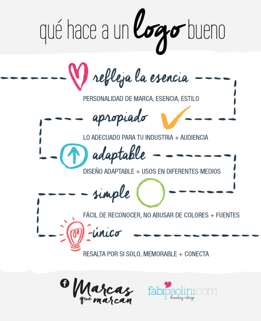
Defining what makes a good logo great is quite subjective. It comes down to how clients feel about their logo and then in turn how their audience perceive it. In the end, you can’t truly control that, but you make and effort to get a reaction and a certain feeling from them. Sometimes you simply look at a logo and know if it’s good or not. However, over the years I feel that there are certain motifs that keep on repeating themselves once and again and again when talking about a good logo. Here are the 5 top things.

Also, I created this free guide which covers all the most common branding + website mistakes you need to make sure you are avoiding.


It reflects your essence

For me this is the key factor to determining what makes a good logo. It’s all about being able to reflect the personality of the brand to its core. Keep in mind though, it doesn’t have to be literal in its concept. So if you sell computers, your logo doesn’t have to have a computer in it. apple

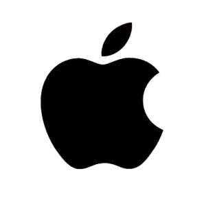
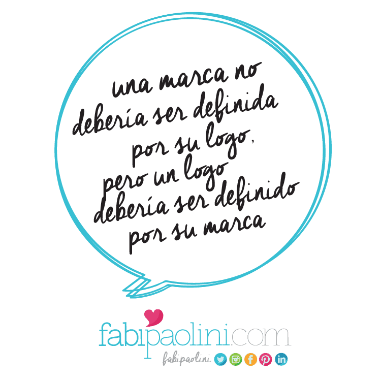
However, what is important is for a logo to be capable of reflecting who your brand is and in someways what it’s about. What do you want people to feel when they look at your logo? How do you want your brand to be perceived? It seems like a lot of weight to be putting on such a “simple” thing, right? But  your logo is your first impression, and it’s what will keep on coming up again and again and again for your audience. They will see it in your website, business cards, social media, invoices, packaging and anywhere else you use it. In the end, a brand shouldn’t be defined by its logo, but the logo be defined by its brand.

Sometimes, a logo reflects exactly what you do. I worked with a client a few years ago that is a music producer. I was able to make the connection instantly on what his logo was going to be. Using his initials “DB” I created a musical note for him that clearly reflects what he does and who he is.

Daniel Baron Logo Fabi Paolini Branding design

5 things that make a good logo great branding + design fabi paolini


Appropriate

It’s important to make sure that the logo is designed taking into consideration what the company does and its target audience. The design must be appropriate for the audience you’re targeting. Last week I talked about the core dimensions of personality and how that affects color psychology. Now, don’t get me wrong. I’m not saying that you should be predictable and boring and not experiment with color, shapes or typography. What I am saying is that if you completely ignore your audience and industry, it could potentially make it harder to make a connection with them. So, for example, if you were selling a product for a Harley Davidson user, having a pink and cute logo might be a bit harder to sell. It’s not impossible, but it’s not truly appropriate for that target audience. I mean look, there are things that simply are more suitable for an industry than others.

This is something I face every single day. Every time I design a logo for a client I really like looking at what the competition is doing. Kind of getting a feel for what is appropriate for the field. Again, it’s not about not taking risks, it’s about having common sense. A few years ago, I designed this logo for a plastic surgeon in Venezuela. It’s appropriate for his industry, but still capable of standing out.Doctor Manuel Lazzaro Branding logo design fabi paolini


Adaptable

In today’s world, it seems that there are almost unlimited ways in which a design must adapt depending on the media it will be used for. An effective design has to work in a variety of applications. This is something that comes up a lot of the time when I design websites, I see how important it is to have a logo capable of adapting to different sizes and directions in order for them to be more effective. I always like to give my clients a few variations of how they can use their logo, that way they have control of how their brand looks. In essence it’s the same logo design, it’s just that it will vary in form to make sure that it stands out no matter where it is. Adaptability feels essential in our digital world. With so many options, you need to make sure that your logo isn’t lost. Think about it: webpages, social media, iPhone, Android, landscape, portrait, business cards…so many different places, so many directions. If your logo doesn’t adapt, will it be seen?

I just finished working on this really amazing project. For it, I created 3 different variations depending on where the logo is to be placed. The actual logo is in 2 lines. When they need to print it small, it’s in one line, and, for social media or icons, it’s just the circle. Make sense?

Adaptable logo design Fabi Paolini branding Way Beyond Jewels


Simple

In my years as a designer, I have found that when a logo is simple, it tends to be more memorable and effective. This helps in making a logo iconic and something that people are capable of recalling which in turn allows for easy recognition. Having a complicated design will make it hard to duplicate or use in different media. It’s important to not overuse different fonts (keep it at 2 at the most) and making sure you’re telling a story with color. Using too many color should only be the case if it’s truly serving your brand’s personality and you’re using color to get a message across. Now, this obviously depends on what you want to come across and how you want people to feel when they look at your logo. Also, this is about personal style. My style has always leaned towards simplicity. It’s simply what I like to do and how I am known as a designer. I don’t feel comfortable doing logos that are too busy. However, regardless of what my personal style is, the biggest and most famous brands in the world have simple designs. That isn’t a coincidence.

Here’s an example of a logo I created for a Mommy and lifestyle blog. Simple and straight to the point. Mia Mommy blog Branding logo design Fabi Paolini


Unique

Finally, a great logo is one that is capable of standing out from its competition. You don’t want your logo to be confused with anyone else. We live in a world where we’re exposed to thousands of messages of all kinds all day, so you want to make sure that your brand image stays with your target audience and is memorable enough for people to make a connection with your business. This is probably one of the hardest things to do. Making a logo that looks and feels unique is not as easy as it may sound, specially when you still have to consider that it should be simple, appropriate and capable of reflecting what your brand is about. I guess what’s essential here is that it grabs the attention of your audience and it’s interesting to look at.

Here’s an example of a logo that is unique and catches your attention. Can you guess what sort of business it’s in? 🙂

Renpacific logo design branding Fabi Paolini


As with anything else, this guideline comes from my own experience and thoughts. In the end, what makes a good logo great is something that comes from a feeling that might be hard to define. It’s intuition, style, and the capacity to connect the brand with its audience. Anyways, let’s recap the 5 guidelines I just went through:

  1. IT REFLECTS YOUR ESSENCE
  2. APPROPRIATE
  3. ADAPTABLE
  4. SIMPLE
  5. UNIQUE

Or, if you’ve visual like me, here it is in a simple infographicWhat makes a good logo great 5 steps and principles branding + design Fabi Paolini

Make sure you download the guide with the most common branding and website mistakes right here:

So, what logos do you absolutely love? Which logos do you feel are great and go beyond just being good? Make sure to leave your comment below.


KEEP ON READING
  • How to Design a logo. What goes int o logo design. Finding a Brand's foundations, Getting Inspired, Designing, cohesive and variety. Fabi Paolini Branding + Design
  • How to Brand Your Business. Branding + business tips and advice. Free guide inside to build your brand's foundation, brand identity, brand experience. Click to download
  • Case Study Fabi Paolini Branding + Design Logo Image Look and Feel
  • How my income increased by 1000% in 6 months. Checklist to boost your own business inside. Business + marketing strategies. Branding + design Fabi Paolini
5 cosas que hacen a un logo genial branding + diseño Fabi Paolini

5 cosas que hacen a un logo genial

Siendo diseñadora, siempre estoy preocupada en asegurarme de que los logos que yo diseño sean los mejores posibles para mis clientes. He trabajado más de 10 años haciendo lo posible en crear logos de los cuales mis clientes se sientan identificados.

Yo siento que determinar qué hace a un logo genial es una mezcla de teoría, intuición y gusto. He estudiando el branding profundamente durante años. Leo sobre el branding todo el tiempo para poder entregarle información enriquecedora a mis lectores y ayudar a construir el negocio de mis clientes. Pero luego, hay una sensación de que a veces la intuición toma las riendas. Estoy completamente segura de que mi proceso creativo me ayuda en construir la idea de la personalidad de la maca en la que estoy trabajando. Eso se convierte en un sentimiento y una vez me siento en la computadora, dejo que mis manos hagan el trabajo. Me imagino que es algo como lo que debe sentir un pintor con un lienzo delante de el. Siempre hago un grandísimo esfuerzo de leer y entender el Brand Brief que he creado para ellos y así formar una idea más clara sobre quien es mi cliente.

Definir qué hace a un logo genial es bastante subjetivo. Al final tiene que ver con como los clientes se sienten sobre su logo y como la audiencia lo percibe. Al final, no tenemos control sobre eso, pero podemos hacer un esfuerzo para lograr una reacción y un sentimiento de parte de ellos. A veces simplemente ves un logo y sabes. Sabes si es bueno o malo. Sin embargo, a lo largo de los años, siento que hay ciertos patrones que se repiten constantemente cuando hablamos de un buen logo. Aquí están las top 5 cosas:


Refleja tu esencia

Para mi este es el factor clave en determinar qué hace un buen logo. Se trata sobre reflejar la personalidad de tu marca y su base. Sin embargo, mantén en mente que no tiene que ser literal en concepto. Si vendes computadoras, tu logo no necesita tener una computadora. Para muestra…

apple

Lo que realmente importa es que tu logo sea capaz de reflejar tu marca y de qué se trata. ¿Qué quieres que la gente sienta cuando ven tu logo? ¿Cómo quieres que sea percibido? Parece un peso grande que se le está poniendo a algo tan simple como un logo, ¿verdad? Pero tu logo es la primera impresión que das, y surgirá una y otra y otra vez para tu audiencia. Lo verán en tu página web, tarjetas de presentación, redes sociales, facturas, empaques y en cualquier otro lugar que lo utilices. Al final, una marca no debería ser definida por su logo, pero un logo sí debería ser definido por su marca.

A veces, un logo reflejar exactamente lo que haces. Hace años trabajé con un cliente y amigo que es un productor musical. Pude hacer una conexión instantánea en cuanto a su logo. Utilizando sus iniciales “DB,” creé una nota musical para el que claramente refleja quien es y qué hace.

Daniel Baron Logo Fabi Paolini Branding design

5 cosas que hacen a un logo genial branding + diseño Fabi Paolini


Apropiado

Es importante asegurarse de que el diseño se haga tomando en cuenta lo que hace la compañía y su mercado objetivo. El diseño tiene que ser apropiado para la audiencia a la cual estás dirigiéndote. La semana pasada hablé sobre las dimensiones de la personalidad y como esto afecta la psicología del color. Ahora, no me mal interpreten. Con esto no estoy diciendo que no se pueden arriesgar y que no experimenten con color, formas o tipografía. Lo que estoy diciendo es que no puedes ignorar por completo la industria ya que esto puede potencialmente hacer más difícil conectar con ella. Por ejemplo, si tu tuvieras servicios de funeraria, tu logo no puede ser rosado y con una letra infantil. Es algo que sencillamente no tiene ningún sentido y no sería apropiado. Es sentido común.

Esto es algo que enfrento cada día. Cada vez que hago un logo nuevo, me gusta evaluar lo que está haciendo su competencia. En parte para ver qué es lo común en la industria y para saber qué es lo que no quiero hacer. De nuevo, no se trata sobre no tomar riesgos, sino de tener sentido común. Hace unos años diseñé este logo para un cirujano plástico en Venezuela. Es apropiado para su industria, y sin embargo, capaz de resaltar.
Doctor Manuel Lazzaro Branding logo design fabi paolini


Adaptable

En el mundo de hoy, a veces se siente como si hay maneras ilimitadas de utilizar un diseño dependiendo del medio en el que será usado. Un diseño efectivo tiene que ser capaz de funcionar en diferentes aplicaciones. Esto es algo que surge cada vez que diseño una página web. Veo la importancia de que un logo pueda adaptarse a diferentes tamaños y direcciones para ser más efectivos. Me encanta darle a mis clientes algunas variaciones de como puede ser su logo dependiendo de donde lo van a usar y así poder tener más control sobre su marca. En esencia, es el mismo diseño de logo, simplemente toma una forma distinta para hacerlo resaltar según donde es usado. La adaptabilidad es esencial en nuestro mundo digital. Con tantas opciones, es importante que tu logo no sea perdido. Piénsalo: páginas web, redes sociales, iPhone, Androide, horizontal, vertical, tarjetas de presentaciones…tantos lugares distintos y tantas direcciones. Si tu logo no se adapta ¿como será visto?

Acabo de terminar este proyecto súper increíble. Para el, creé 3 distintas variaciones dependiendo de como será usado el logo. El logo real está en 2 líneas, cuando lo tienen imprimir pequeño, está en una línea y finalmente para redes sociales está el círculo. ¿hace sentido?

Adaptable logo design Fabi Paolini branding Way Beyond Jewels


Simple

En mis años como diseñadora, he encontrado que cuando un logo es simple, tiende a ser más memorable y efectivo. Esto ayuda en hacer a un logo icónico y algo que la gente es capaz de recordar y reconocer. Tener un diseño de logo complicado lo hará difícil de recrear y usar en varios medios. Es importante no sobre utilizar las fuentes (mantenlo en 2 como máximo) y asegurarte de estar contando una historia a través del color. Usar demasiados colores solo debería hacerse si sirve un propósito específico para tu marca y la personalidad de la misma. Obviamente, todo esto depende de lo que quieres comunicar y como quieres que la gente se sienta cuando ven tu logo. Además, se trata sobre estilo personal. Mi estilo siempre ha sido hacia lo simple. Sencillamente es lo que me gusta hacer y es por lo cual soy conocida como diseñadora. No me siento cómoda haciendo logos sobrecargados. Sin embargo, más allá de mi estilo personal las marcas más famosas y grandes del mundo tienen diseños sencillos. Eso no puede ser coincidencia.

Aquí les muestro un ejemplo de un logo que creé para un blog de mamás. Simple y directo al punto.
Mia Mommy blog Branding logo design Fabi Paolini


Único

Finalmente, un gran logo es capaz de resaltar de la competencia. No quieres que tu logo sea confundido con ningún otro. Vivimos en un mundo en el cual estamos expuestos a miles de mensajes cada día, así que quieres asegurarte de que la imagen de tu marca se mantenga en la mente de tus consumidores y que sea memorable de tal manera que tu audiencia haga una conexión con tu negocio. Esto es probablemente una de las cosas más difíciles de hacer. Crear un logo que se sienta único no es tan sencillo como puede sonar, especialmente si consideras que debe ser simple, apropiado y capaz de reflejar de qué se trata tu marca. Me supongo que lo esencial es que atraiga la atención de tu audiencia y sea interesante de ver.

Aquí les muestro una ejemplo de un logo único que llama la atención. A que no adivinan en qué industria se encuentra 🙂

Renpacific logo design branding Fabi Paolini


Al igual que con cualquier otra cosa, estos 5 aspectos vienen de mi propia experiencia y de mis pensamientos. Al final, lo que hace a un logo genial es una sensación difícil de definir. Es intuición, estilo, singularidad y la capacidad de conectar a la marca con su audiencia. De todos modos, recapitulemos los 5 aspectos que mencioné anteriormente:

  1. REFLEJA TU ESENCIA
  2. APROPIADO
  3. ADAPTABLE
  4. SIMPLE
  5. ÚNICO

O, si eres visual como yo, aquí hay una infografía simple sobre el tema5 cosas que hacen a un logo bueno branding + diseño Fabi Paolini

Así que cuéntame, ¿cuáles logos te encantan? ¿Cuáles logos sientes que van más allá de ser simplemente “buenos”? Asegúrate de dejarme tu comentario abajo.

Share this Post